Top Web Design Trends for 2025
November 8, 2024
As we look forward to 2025, web design is taking on new dimensions, focusing on user engagement and aesthetic appeal more than ever. One trend that’s gaining momentum is the incorporation of decorative elements, particularly hand-drawn and quirky illustrations. These elements not only add a personal touch to websites but also bring a sense of creativity and uniqueness that can make a brand stand out. Here are some of the highly anticipated and Top Web Design Trends for the year 2025:
01.
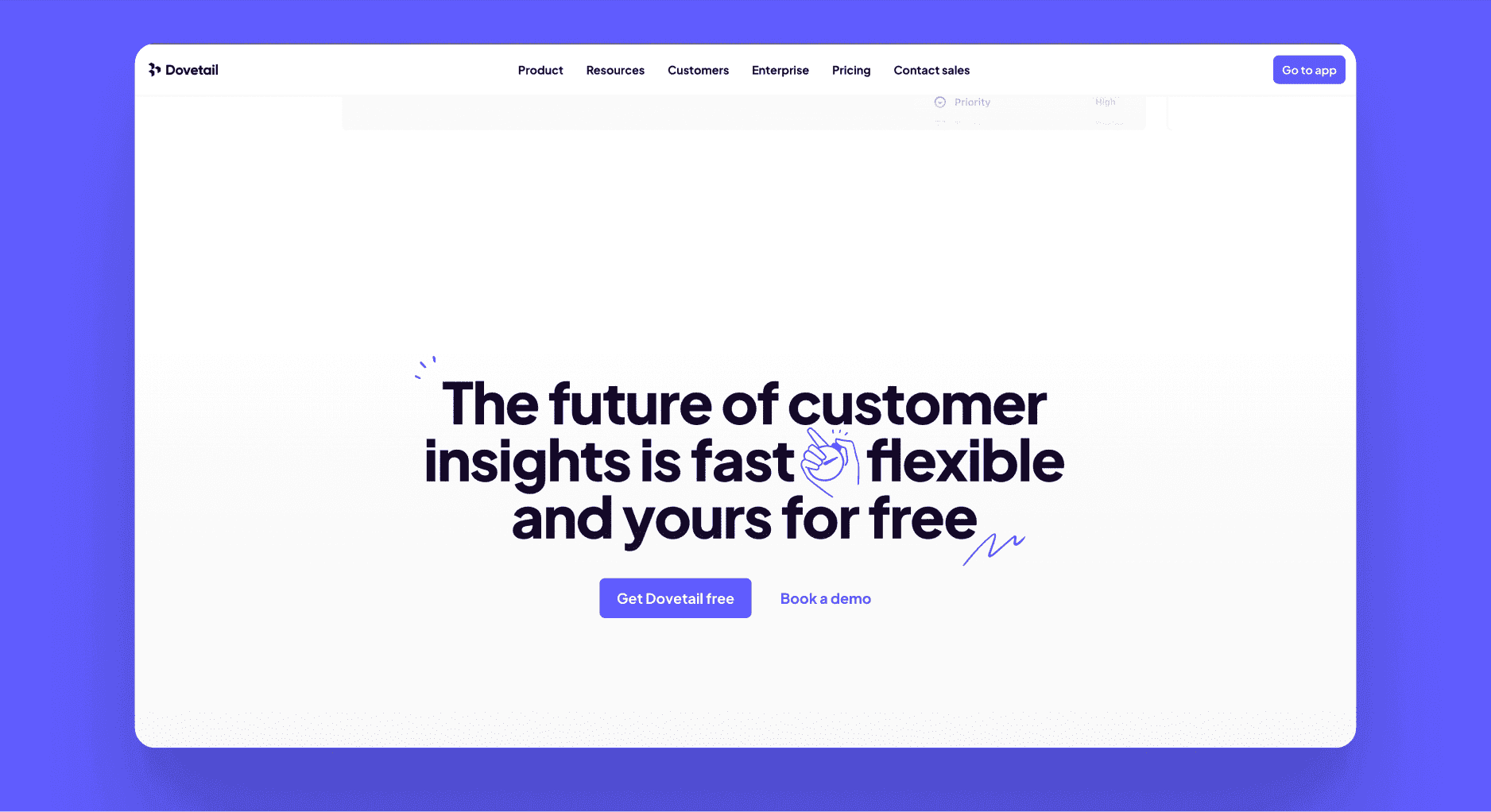
Quirky illustrations are becoming a popular choice for web designers looking to infuse character and personality into their projects. Biggest reason why people connect with them is because they are imperfect. These hand-drawn illustrations often feature whimsical designs, unexpected elements, and a playful tone that resonates with audiences seeking something different from the standard corporate look.
For example, a startup’s website might use fun, quirky illustrations to create a more approachable and relatable brand image. These types of website illustrations not only capture attention but also help to convey a brand’s message in a more memorable way.
Landing page of Dovetail
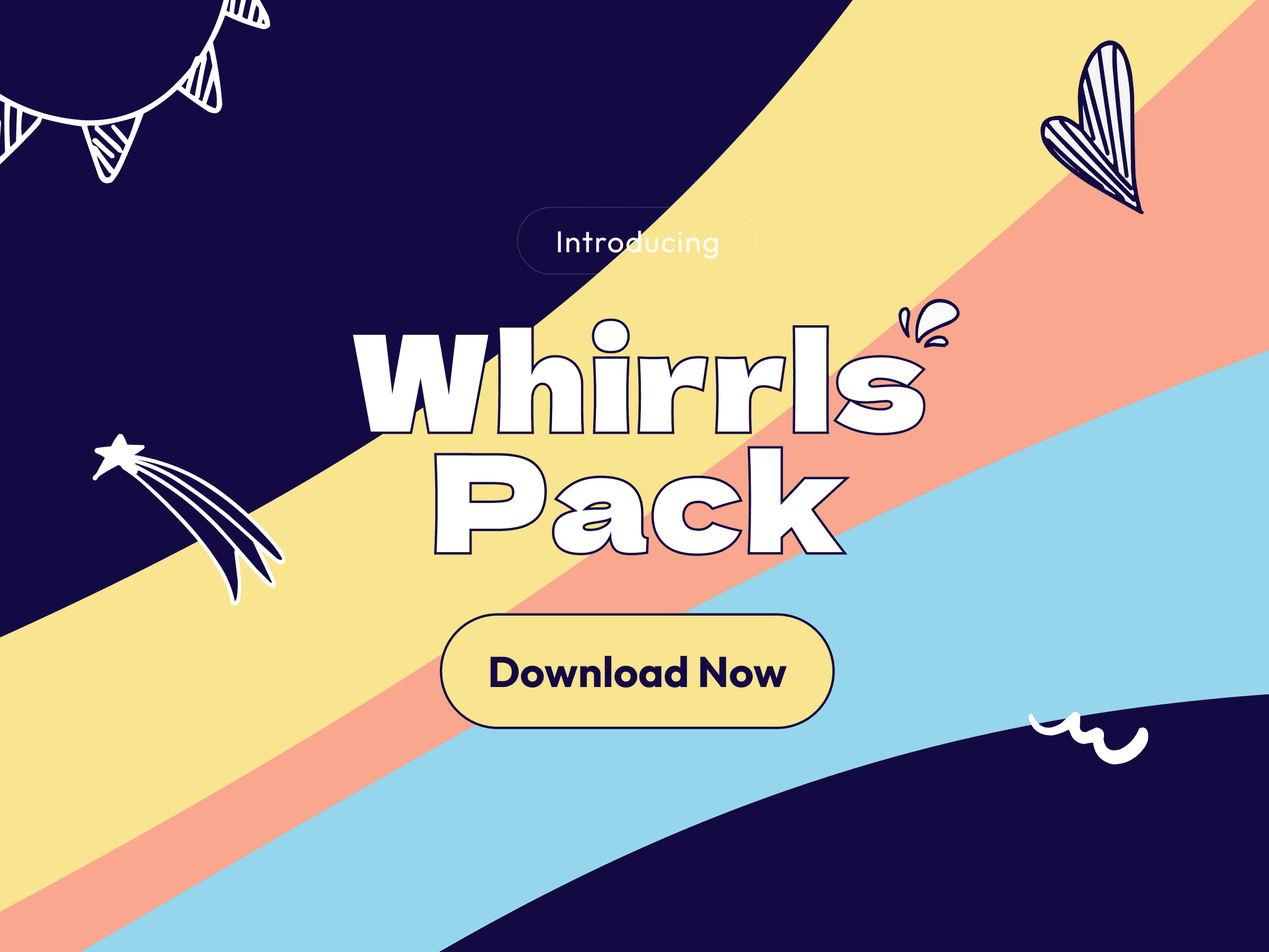
If you're looking to incorporate this trend into your own projects, Whirrls offers a curated collection of hand-drawn illustrations that are perfect for adding that quirky, creative touch to your designs. With a variety of fun and unexpected elements, Whirrls can help you create a unique visual identity that stands out in today’s competitive digital landscape.
02.
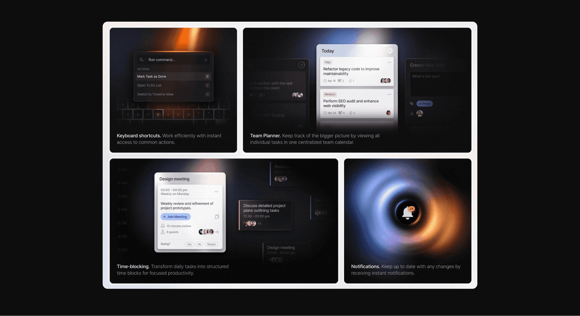
Bento grids, a trend inspired by Japanese bento boxes, offer a structured yet flexible way to present content on a website. These grids allow for varied content blocks that can be arranged in a way that feels both organized and creative. Incorporating decorative elements, such as hand-drawn icons or subtle illustrations, within these grids can add a layer of depth and interest to the layout.
For those looking to explore and implement this trend effectively, Bentogrids provides an excellent resource. The site offers tools and inspiration for creating bento-style grid layouts that are both functional and visually engaging, making it easier to achieve a balance between structure and creativity in your web design projects.
Features section of Huly
03.
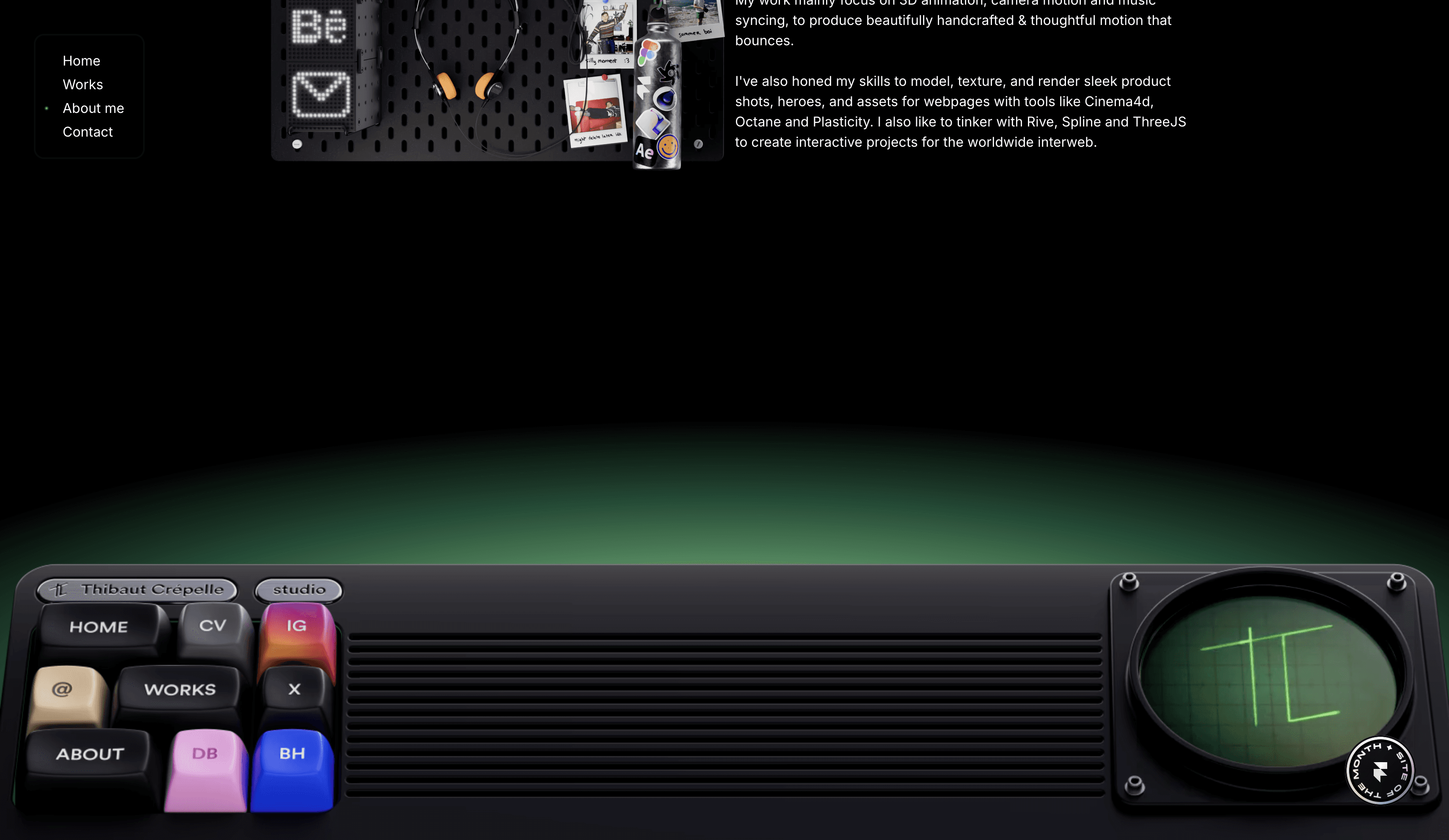
Footers, once an afterthought in web design, are now being transformed into a canvas for creativity. In 2025, expect to see footers taking up more space and playing a more significant role in the overall design of websites. These huge footers often include a mix of essential information, like contact details and links, along with decorative elements like hand-drawn illustrations or a unique illustration pack that ties the entire site together. Making your footer a visual masterpiece also portrays your craftsmanship and attention to detail.
footer.design showcases a variety of footer designs that push the boundaries of traditional layouts, offering inspiration and practical examples of how footers can be leveraged to enhance the overall user experience and brand identity.
Footer from Thibaut portfolio
04.
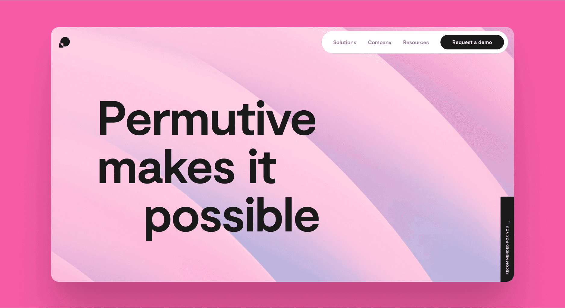
The trend of huge typography continues to dominate in 2024, with oversized fonts making bold statements on websites. When combined with decorative illustrations, this trend can create a dynamic and eye-catching design that is both functional and artistic. Do note that this might affect the comprehensibility of the site to some extent as it makes the site difficult to scan and understand what your site/product is about.
Sites like awwwards.com have an array of websites which make use of these bold type and could serve as an inspiration if you choose to hop on this trend.
Landing page of Permutive
05.
Almost every website which has a story to narrate and a vision to sell are now resorting to immersive scroll-based transform effects. Generally it is referred to as scrolljacking where you take over the control of the pace and direction of thee website scroll. However, there is a line between immersive storytelling and overloading users by having a mismatch with their mental models - this could result in a bad experience to the user. Refer to this article by NN group for more details.
Landing page of Superpower
06.
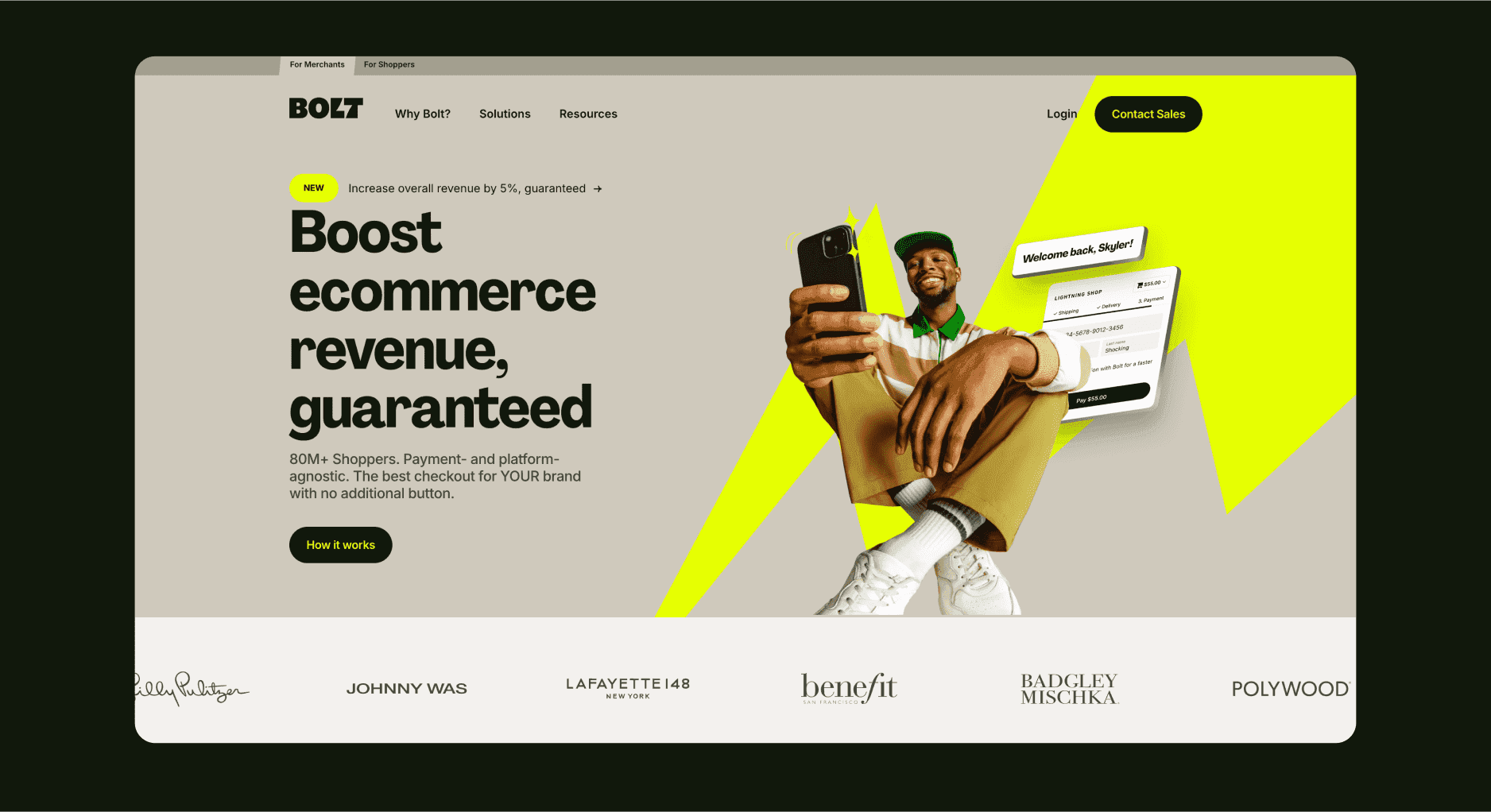
Landing page of Bolt
Designers are moving away from muted palettes and embracing vibrant, eye-catching colors that evoke strong emotions and encourage user interaction. These vivid colors can be paired with quirky illustrations or hand-drawn elements to further enhance the visual impact and reinforce the brand’s personality.
07.
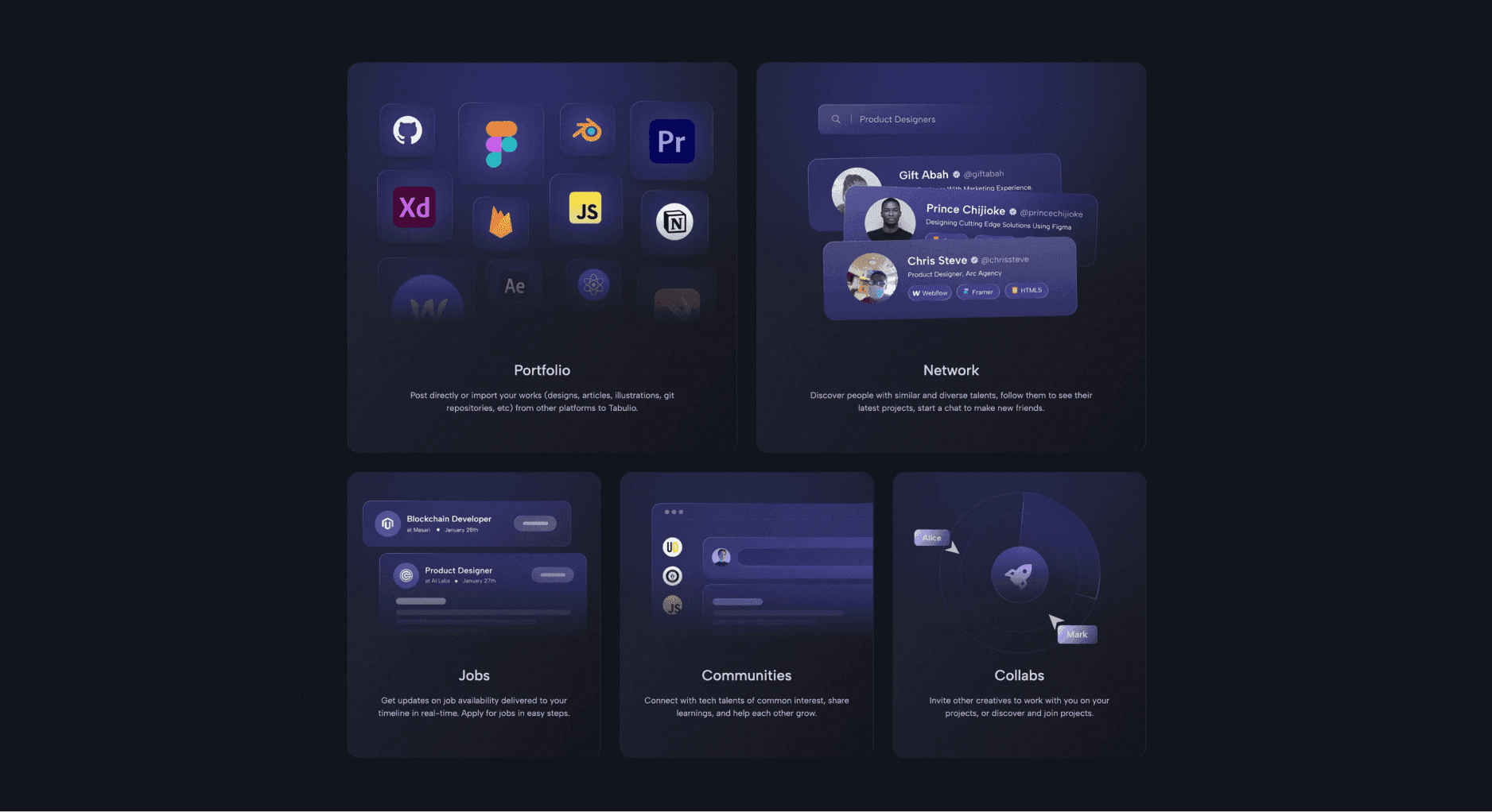
Glassmorphism often works well with dark mode, gradients and lighting effects, enhancing the overall aesthetic while keeping the design light and airy. With AI based companies taking over the tech world by storm, this is one of the most sought after trends in recent times.
Do note that there are several pitfalls with using glassmorphism like compromising accessibility, making the site heavy because of blurs and so on. So do use these effects sparsely with a lot of thought.
Landing page of Tabulio
08.
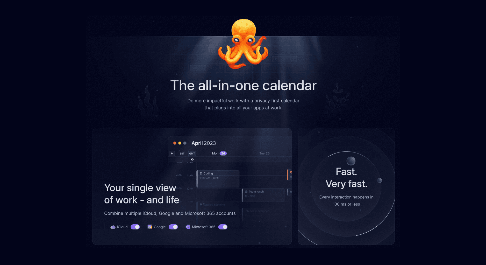
Lighting effects have become a prominent trend in web design, adding a sense of realism and depth to digital interfaces. By simulating shadows, reflections, and light sources, designers can create a more immersive experience for users. When coupled with dark mode and glassmorphic designs, they truly uplif the visuals of the website and give that futuristic look.
Landing page of Hypercal
09.
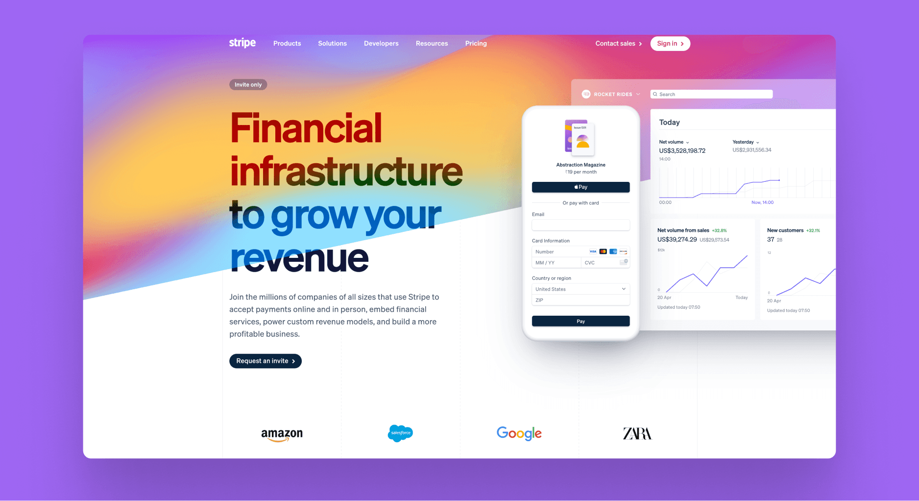
This is one of the trends which has considerably evolved over time. From simple linear gradients to animated mesh gradients with mouse effects, this trend has a variety of options. Successful companies like Framer and Stripe make use of these gradients in a unique and effective way. fects have become a prominent trend in web design, adding a sense of realism and depth to digital interfaces. By simulating shadows, reflections, and light sources, designers can create a more immersive experience for users. When coupled with dark mode and glassmorphic designs, they truly uplif the visuals of the website and give that futuristic look.
If you are someone who is looking for some really stunning gradients to elevate your visuals, gradient packs might be a very good way for you to get started.
Landing page of Stripe
10.
Custom cursors are a small but impactful trend gaining traction in 2024. By customizing the cursor's appearance or adding interactive effects, designers can create a more immersive and personalized experience for users.
Whether it's a cursor that changes shape as it moves over different elements or one that incorporates hand-drawn illustrations, this trend allows for a playful and creative interaction that enhances the overall design. Custom cursors are particularly effective on portfolio sites, creative agencies, and websites aiming to provide a unique user experience.
No code platforms like Wix Studio and Framer have also launched features that enable users to create their custom cursor with ease. This subtle yet effective trend shows that even the smallest details can contribute to the overall aesthetic and feel of a website.
11.
Moving away from rigid grids and perfect geometric shapes, the design world sees a rise in the use of organic, imperfect shapes in web design. These shapes add a sense of fluidity and natural movement to a website, creating a more relaxed and approachable atmosphere.
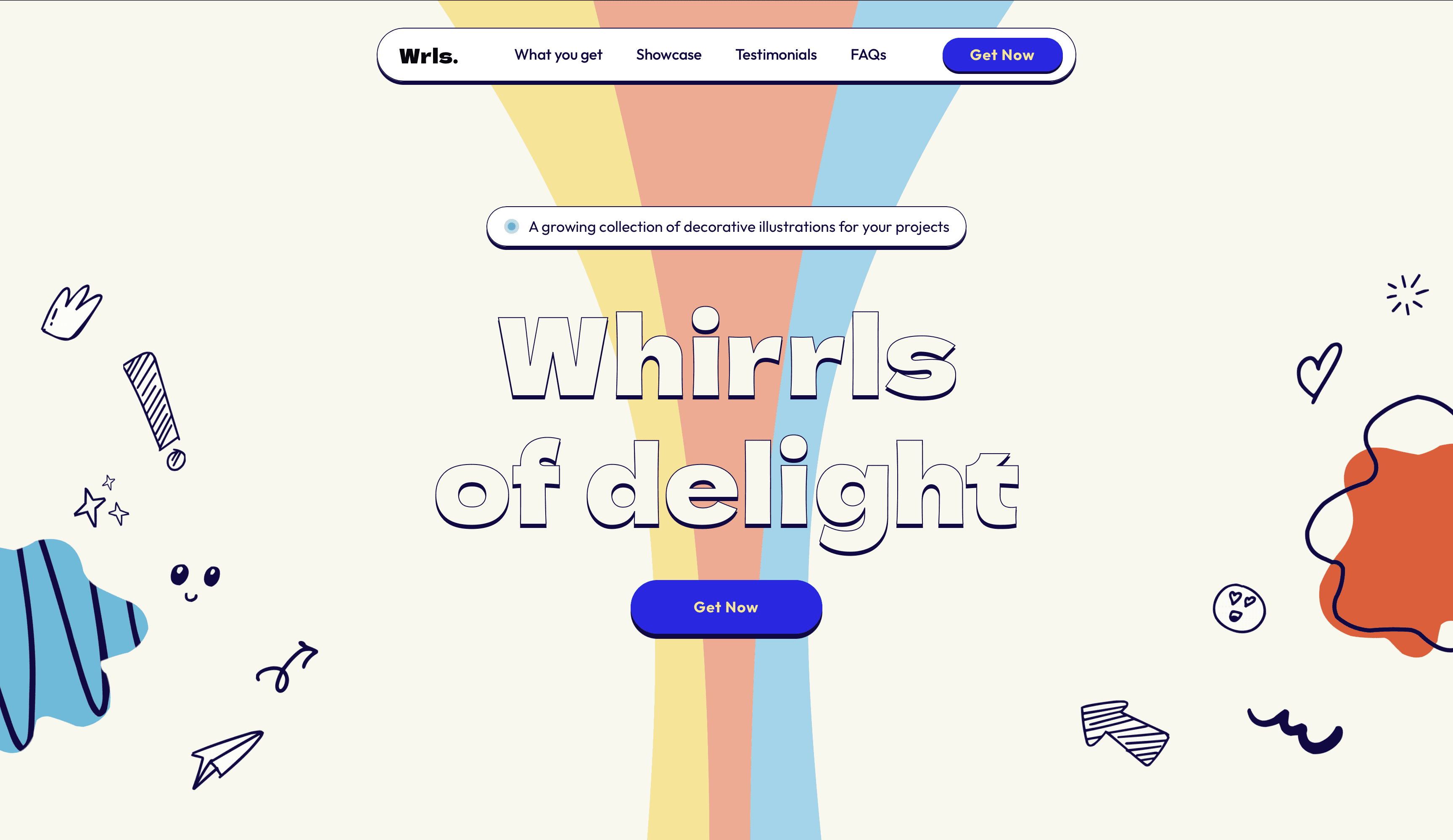
Organic shapes can be used in backgrounds, as dividers, as part of the overall layout to break the monotony of straight lines and right angles or even in more creative ways with masks and overlays. PS. Whirrls pack also have a ton of organic shapes which you can use in a variety of ways to break the monotony of your sites.
From Whirrls Landing Page

