How to make your designs "pop"
November 10, 2024
Every product designer has likely encountered the vague yet ubiquitous request to make a design "pop." While this feedback can sometimes feel frustratingly non-specific, there are practical techniques that can help elevate the visual impact of your designs. Let's look at some techniques and hacks to achieve this quickly and effortlessly.
01.
Why it matters: Visuals are the first point of engagement in digital design. A compelling image can make or break the user's first impression.
How to implement:
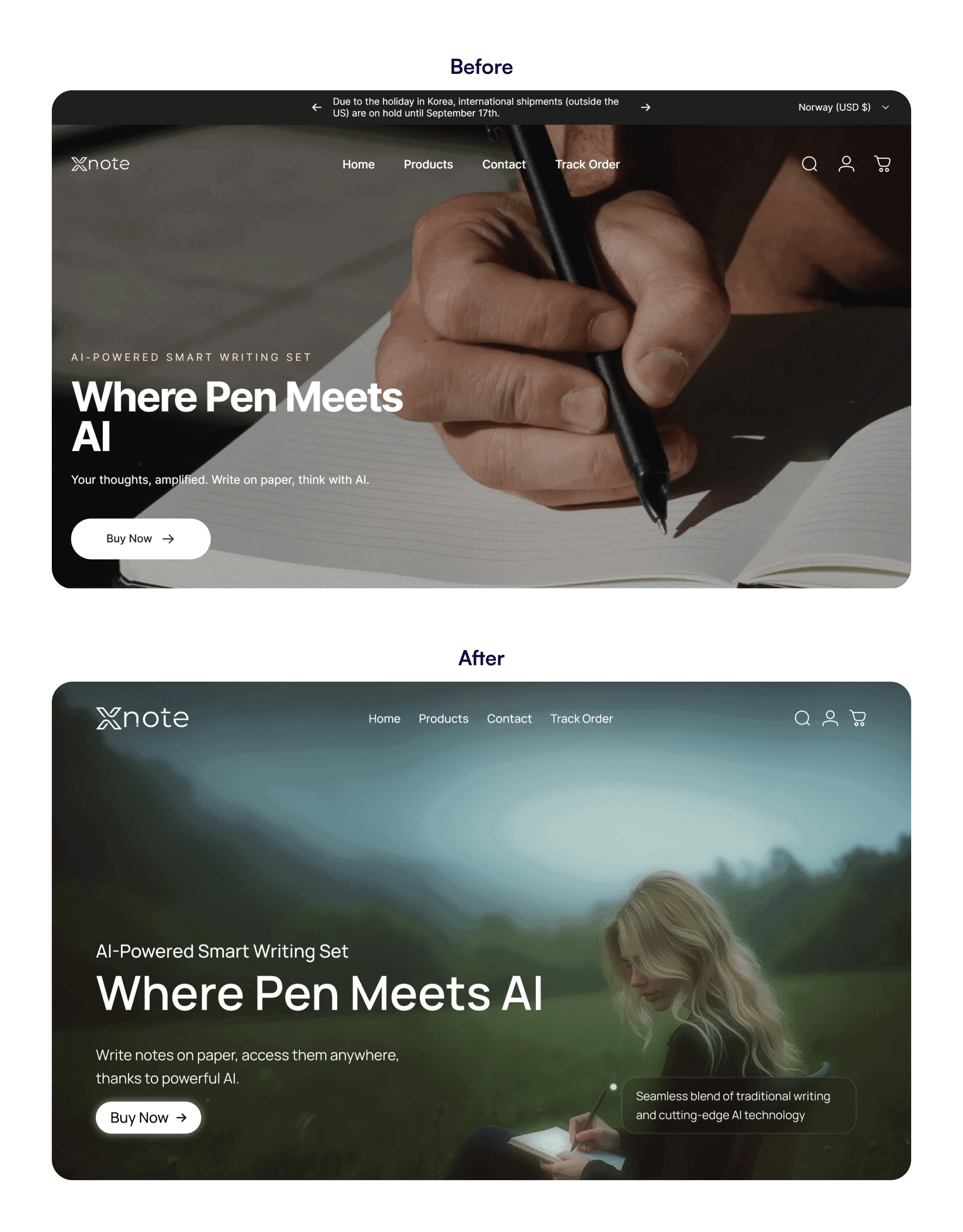
Choose high-saturation and vibrant images: These images stand out more and can enhance the perceived quality of your design.
Context and balance: While vibrant images can attract attention, they need to complement the overall design. Make sure the structure of your design is aligned with the image that you are using. The goal is that image must complement the design and direct attention to places you want the user to go to.
From Heroast
Pro tip: Steer clear of clichéd images from popular stock photo sites, as they can make your designs feel generic. While custom photography is ideal, it’s not always feasible. Opt for alternatives like Unsplash, which tend to provide images that feel more authentic and less like typical stock photos.
02.
Why it matters: Depth and dimension can be pivotal in making elements stand out and giving your design a dynamic feel.
How to implement:
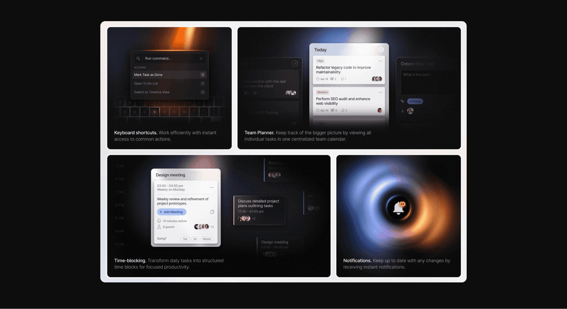
Shadows and glows: Use tools like Figma, Adobe XD, or Sketch to apply drop shadows and outer glows to elevate key elements from the background. Experiment with different blur and spread settings to get a subtle yet effective lift.
Directional lighting effects: This can help simulate a light source and add a layer of realism to digital interfaces. It’s particularly effective on buttons, icons, and other interactive elements.
Example: Websites like Framer and Hypercal utilize subtle animations with these effects to draw attention to crucial elements like CTAs.
Landing page of Hypercal
Features section of Huly
03.
Why it matters: Color is a powerful tool in design, capable of influencing mood and user behavior.
How to implement:
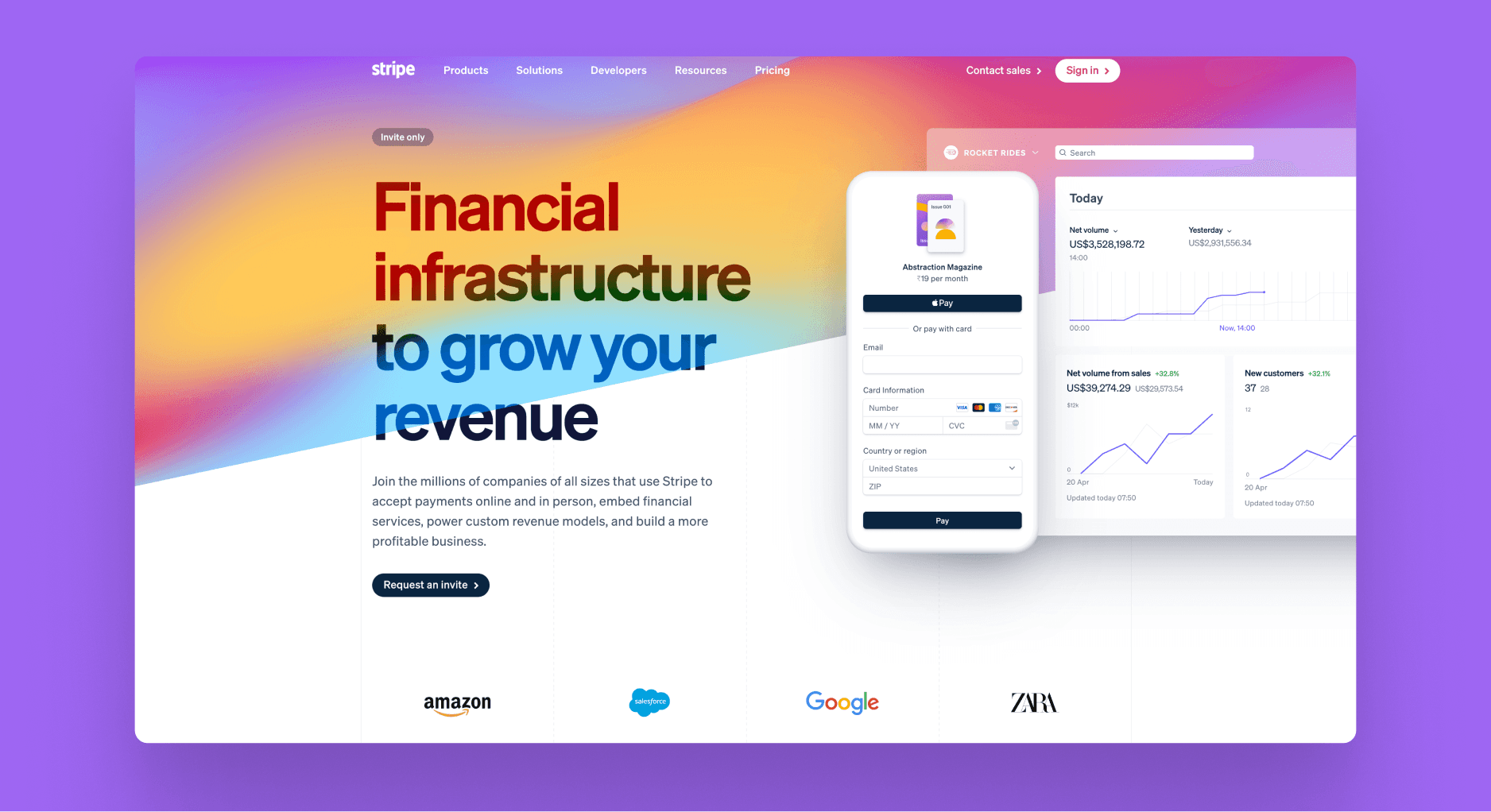
Exploit the psychology of color: Different colors can evoke different feelings. For example, red can energize and attract attention, while blue can instill a sense of trust.
Contrast for accessibility: Ensure that your text contrasts sufficiently with the background, which not only pops but is also crucial for readability. Tools like WebAIM’s Contrast Checker can help you test and adjust your color choices.
Considerations: Always keep the brand’s color palette in mind. If the palette is subdued, consider using these colors strategically as accents rather than the main theme to introduce vibrancy without overwhelming the senses.
Landing page of Stripe
04.
Why it matters: Strategic use of graphics and decorative elements can significantly enhance the visual appeal of a design. They serve not just as beautification but as functional components that guide users' attention and enhance usability.
How to implement:
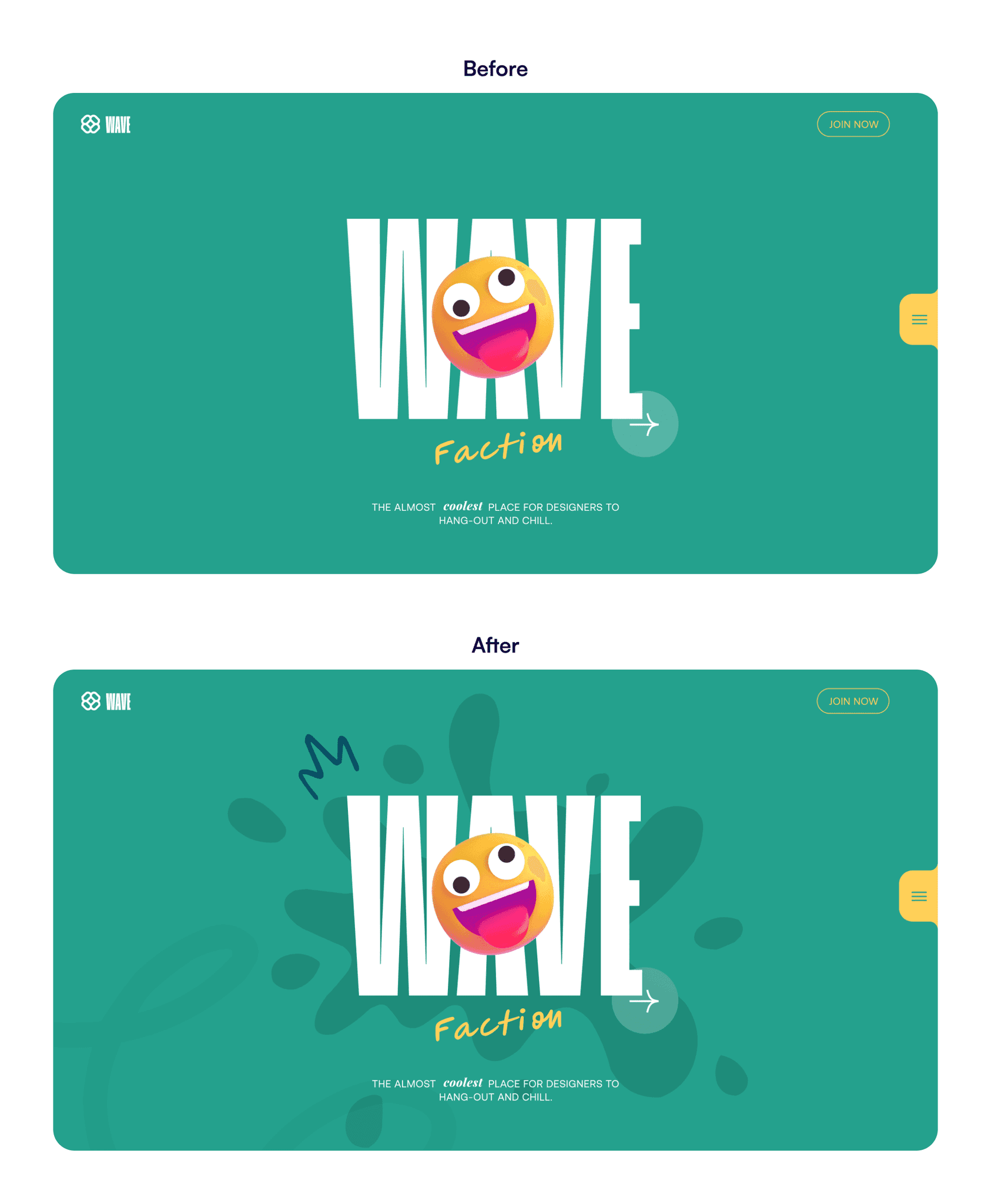
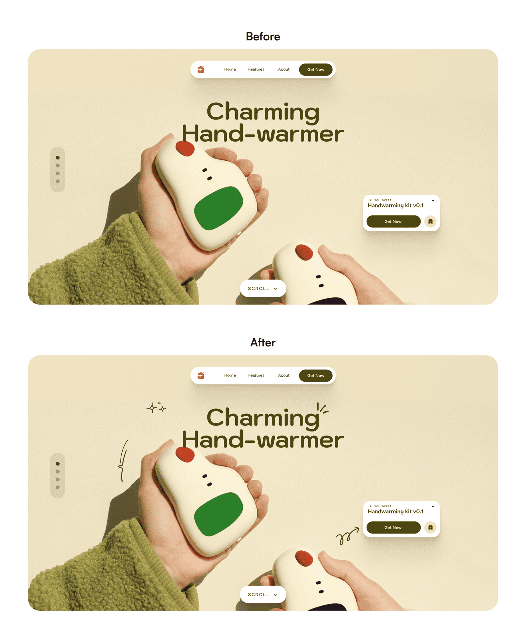
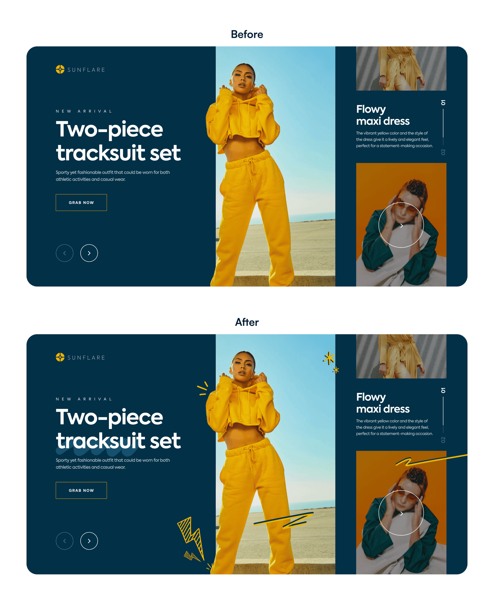
Guide Attention: Use elements like hand-drawn icons or splashes to lead the eye toward key areas such as CTAs and important information. This is where decorative illustration packs like Whirrls come in really handy.
Set the Tone: Decorative shapes and illustrations can set a mood or theme, making a digital environment more inviting and engaging.
Spotlight on Whirrls: For designers looking to effortlessly add a touch of creativity and fun to their projects, With over 800 illustrations, Whirrls offers a versatile collection of hand-drawn illustrations. These can be particularly effective in projects like social media posts or client websites where a unique, friendly vibe is beneficial.
Tip: Integrating elements like those in Whirrls should feel seamless and serve the design’s overall narrative. Even a single well-placed decorative icon can elevate a design without overwhelming it.
More examples of designs using Decorative Elements from Whirrls
Making your designs "pop" doesn't have to be a mysterious quest. By strategically using vibrant imagery, adding depth through lighting and shadows, selecting impactful colors and using decorative visuals, you can create designs that not only pop but also perform effectively. Remember, the goal is to enhance usability and aesthetic appeal, creating a balance that serves both the client’s brand and the end users' experience.

